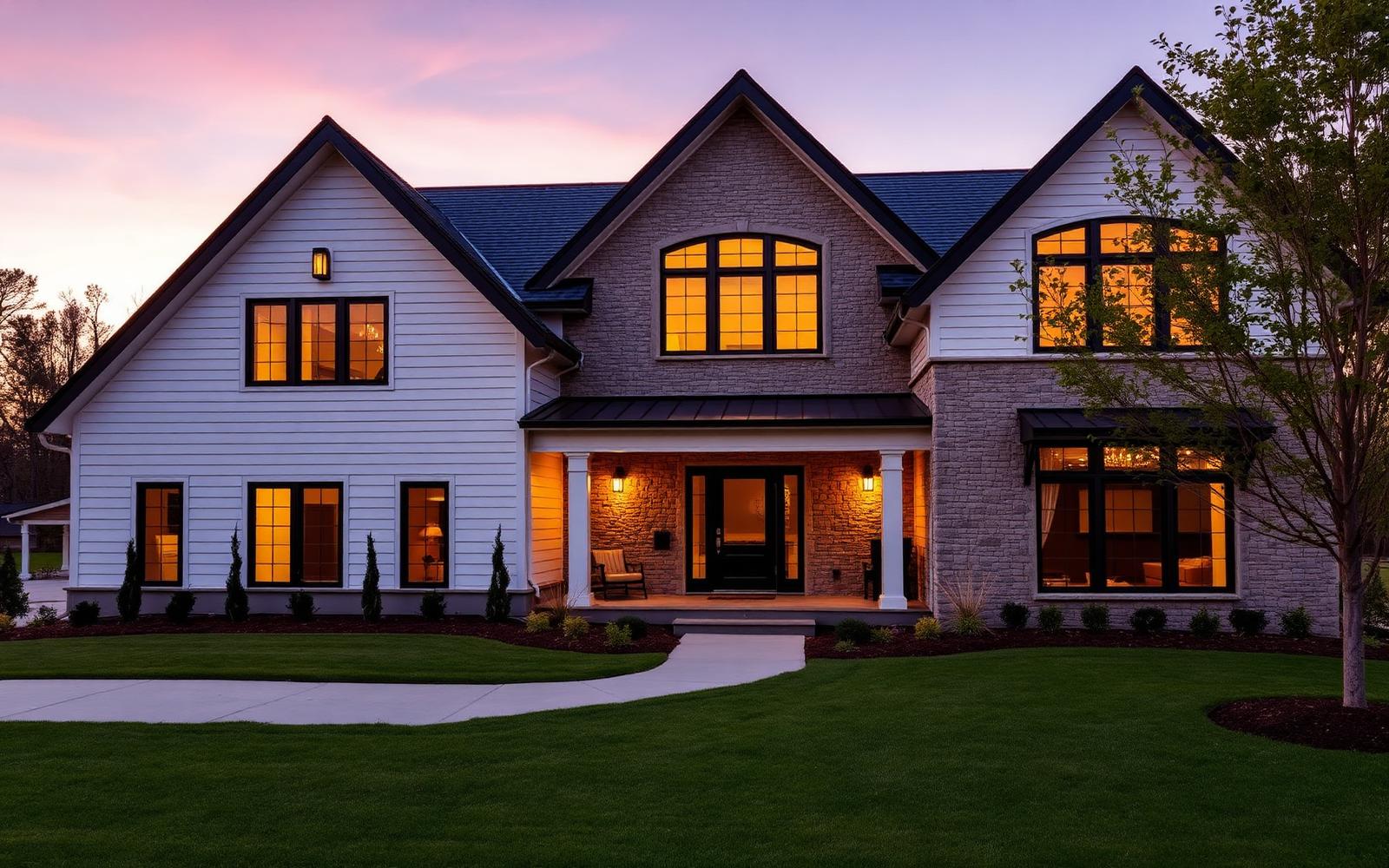
Twelve directions for the Winget Homes website.
Same content, same structure, twelve distinct looks. Open each one, click through the pages, and pick the feel that fits Winget Homes.
Atelier
Dark, editorial and cinematic. Full-bleed photography, brass accents, serif headlines.
Architect
Architectural and precise. Paper white, drafting rules, mono labels, data-rich diagrams.
Hearth
Warm and welcoming. Sand and terracotta, soft curves, friendly and approachable.
Meridian
Modern minimal gallery. Deep forest and bone, oversized type, generous white space.
Four more concepts with a sharper, more architectural point of view — still clean and beautiful, but with bigger type, stronger color, and more confident layouts.
Obsidian
Blacked-out grid system with acid-lime signal color, mono data labels and hard edges.
Foundry
Concrete-grey brutalism. Stacked poster type, safety-orange accents, heavy black rules.
Flux
Night-indigo with cyan and magenta gradients, soft glass panels and big rounded forms.
Press
Newsprint editorial. Rule-lined columns, huge serif headlines, one shot of signal red.
Four concepts drawn from the strongest patterns on leading builder and design-build sites — national-luxury polish, regional-modern warmth, award-forward coastal craft, and a practical remodeler layout with cost guides and clear service paths.
Estate
National-luxury polish. Deep navy and gold, classic serif headlines, collection cards and an award band.
Canyon
Southwest desert modern. Clay, sage and sun-bleached stone with wide landscape photography.
Harbor
Coastal New England. Crisp white, slate blue, awards and testimonials front and center.
Studio
Remodeler-forward and practical. Bright white, teal accents, cost guides and clear service tiles.
The Estate direction shown with real Winget Homes project photos instead of stock imagery.